Challenges
Super Neon Colosseum
These difficulties centre on programmable interface tasks, which were assigned as an individual responsibility.
Animating the Interface
Challenge
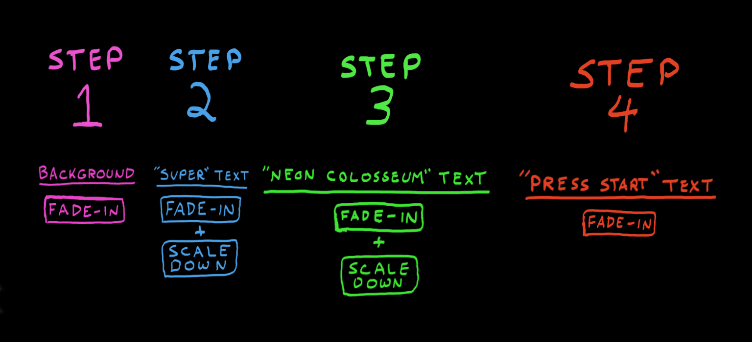
Before reaching the start screen, the team wanted a flashy animation to reveal the title of the game and emphasize the vibrant eighties-inspired aesthetic.Action
After importing the art assets for the background and title into a widget blueprint, the animation was broken into individual components. First, the background would fade in. Then two separate portions of the title scaled down into frame to reveal Super Neon Colosseum. Finally, the Press Start prompt appeared. The animation was assembled using keyframes and executed with a Play Animation node.Result
Breaking the animation into components helped clarify what was required for implementation. It also made it easier to adjust the concept before fully committing it in the Blueprint.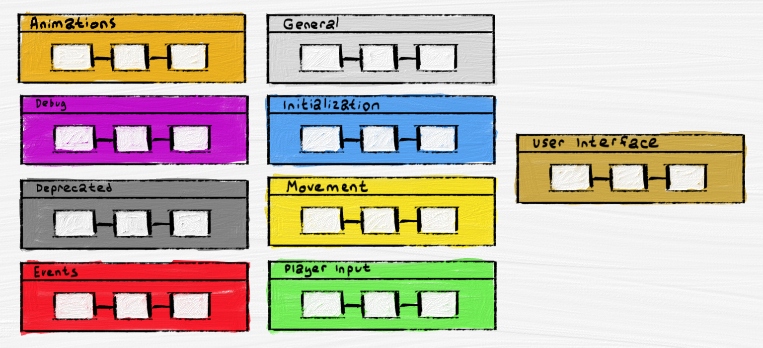
Comments and Groups
Challenge
Although comments and groups were used throughout the blueprints, a scrum meeting revealed that programmers were often being delayed before starting their a task. This was mainly due to the time spent navigating between different sections of logic.Action
A system was introduced where groups were assigned thematic colours to represent specific types of logic. The legend shown above was provided to help programmers quickly identify what they were looking at.Result
After implementing the new grouping system, programmers reported that navigating the blueprints became much easier. This improvement reduced wasted time and boosted overall productivity.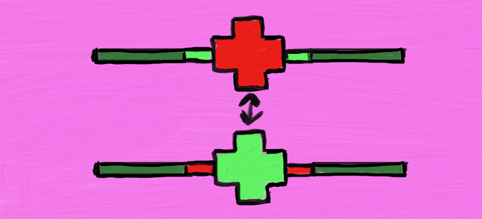
Getting the Player's Attention
Challenge
Survey results showed that players were not recognizing that their vehicle was low on health. The goal was to adjust the interface to convey this information more effectively.Action
Animations were tested to make the health indicator more noticeable. The final version, shown in the image above, replicated flashing similar to emergency vehicle beacons. The medical cross icon began red with a green health bar, and the two colours alternated repeatedly. This effect was triggered through aPlay Animation node, with a short Delay added to create a controlled pause between colour changes.
Result
Players quickly recognized when their vehicles were in critical health. This prompted immediate action to locate and collect health packs placed throughout the maps.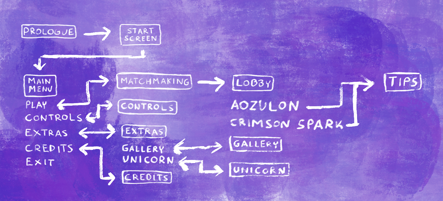
Navigating the Front-End
Challenge
Coding the majority of the front-end interface was challenging due to the many different menu navigation options.Action
Flow charts were created to outline the front-end layout. While a more detailed wireframe was made during pre-production, the condensed version shown above illustrates the final product. Text with squares represents individual menu pages, while text without squares indicates selectable options. Arrows displays which menu the player is taken to when an option is selected.Result
The flow chart provided a clear visual map of the front-end layout, making it much easier to implement the intended design. It also allowed other team members to quickly understand the structure, enabling them to assist efficiently when needed.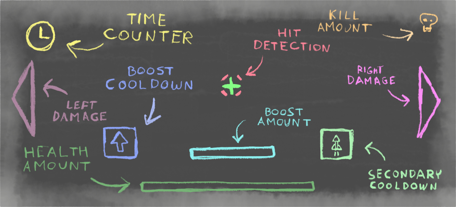
Public Variables
Challenge
Multiple aspects of the game were being developed by different programmers. At times, completing a task required accessing values from logic another team member was creating, which was especially common for the head-up display.Action
Clear communication was essential. Team members kept each other informed about which variables needed to be made public so certain values could be shared. The head-up display image above illustrates a breakdown of its individual elements, many of which relied on data from other developers’ work.Result
By maintaining clear communication about public variables, tasks such as creating a responsive interface that accurately displayed player boost and health were completed. This was achieved by accessingInteger values representing the remaining amounts.